Psychology of Color: How Color Impacts Feelings about Art
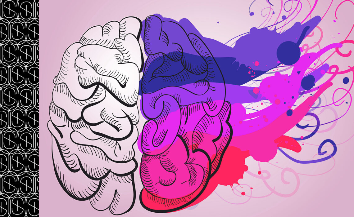
Color is the sensation stimulated in the brain by wavelengths of light; each wavelength stimulates the perception of a distinct color, which is varied throughout the color spectrum. Color can have a powerful impact in a home or office. Individuals are drawn to certain colors for a variety of reasons, and there are also stereotypes about individual colors. Colors can encourage a myriad of emotions, including calm, anxiety, and even hunger!
Choosing works of art to suit your personality, space, and the feelings you want to invoke in a room can be achieved with some understanding of the effect of color in art. Understanding how colors can fit into a display location can help collectors make choices based on a balance of space and state of mind desired within the room.
Psychology of Color
Most individuals will admit that colors affect their mood, but there is more to it than a general feeling; the psychology of color is based on the emotional, and at times even physical, effects that colors have on people. Taking into consideration that there are cultural variations which affect the meaning of certain colors (i.e. pink for baby girls and blue for baby boys is not a universal opinion), there are common psychological effects of colors. The colors you surround yourself with can directly influence your mood.
Let’s explore some of the psychology of color‘s theory of emotions, and some of the significance they hold to artists and art lovers:
Cool Colors
Known to create calm and harmonious feelings, cool colors can even go as far as invoking sadness and depressive thoughts.
- BLUE: Invoking compassion and wisdom, truth and loyalty. In a more negative tone, it can be considered cold and uncaring, and is often associated with resignation and solitude.
- GREEN: A harmonious color, green encourages a calming, comfortable attitude, filled with hope and healing. Associated with success, it can also invoke a sense of greed or jealousy.
- PURPLE: The traditional color of royalty, this color is associated with wealth and respect. Used in holy days in the Catholic church, it also signifies mystery and spirituality.
Warm Colors
The psychology of color indicates that stimulating warm colors can increase energy and appetites; along with this also comes increased irritation and anxiety.
- RED: Associated with romance and excitement, this color exudes power and ambition. However, it is also known to increase the sensation of danger, rebellion and violence.
- ORANGE: Often considered an extravagant color, orange is also seen as an enthusiastic and joyful color. Believed to be a model for service and warm, it can also correspond to aggression and domination.
- YELLOW: Most often thought of as the color of happiness, this traditionally cheerful color invokes friendship and imagination. However, one must not forget the other side of the yellow coin—it is used to demonstrate caution, danger, and even aging.
Neutral Colors
- WHITE: Showcasing purity and innocence, this color is universally considered for cleanliness. However, it is also a stark color, displaying sterility, and in some cultures, signifying death.
- GREY: The “king” of neutrality, this color represents compromise, and gives a sense of peacefulness. It can, at times, be associated with sadness or melancholy.
- BROWN: The color of “nature”, brown is associated with comfort and warmth. However, as a somewhat “drab” color, it can also set a somber tone.
- BLACK: In a positive light, black can be sophisticated and mysterious. However, it is considered in most western cultures as an example of morbidity and death.
Artists Use the Psychology of Color for Expression
Artists use color within their work to enhance a mood or send a message, either in a positive or negative way.
- Early 1900’s, Picasso sank into depression. Painted figures in blues to enhance sadness.
- Van Gogh’s painting about agricultural workers, “The Potato Eaters”, in browns & greens, draws focus on their connection to the earth.
- Klimt’s painting of a serene lake exemplifies the peacefulness of nature in hues of green.
Using the Psychology of Color When Choosing Works for Your Enjoyment
The colors you are drawn to in works of art will help you decide the ideal location to display the piece. In the alternative, you may be looking to place art in a specific room, and using the psychology of color will help you choose the right work for your site.
To spark an optimistic feeling in a location, look for greens and yellows. The color yellow is a major element in chromotherapy, and can help with both digestion and metabolism, making it a perfect choice for a kitchen. To invoke a restful feeling, as in a bedroom, blues can provide the calming tone you are looking for. On the other hand, to increase the feeling of romance, red can be used in the bedroom (although it would be best in lesser amounts).
When choosing art for your display and enjoyment, consider the feelings colors invoke; you can enhance (or degrade) the subtle tone of the room with the right (or wrong) choice. Let the experts at Sybaris Collection help you select the perfect pieces to fit your room, your attitude, and your style!
