Casa Nakasone
Photo Courtesy of Sybaris Collection
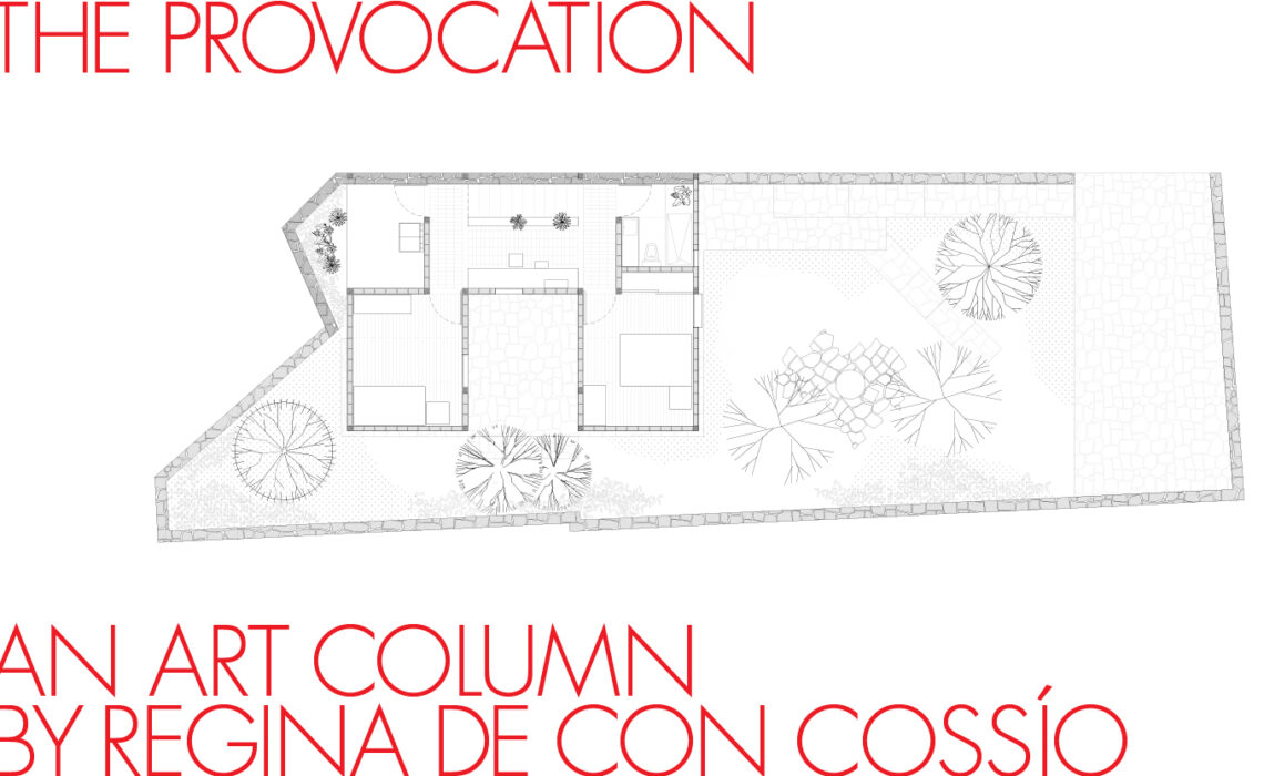
1/ The Project Casa Nakasone
Casa Nakasone is a collaboration project I did with Escobedo-Soliz architectural firm, in which I activated their new piece, a residential house “Casa Nakasone”, located in Mexico City, with art. For the project, pieces by Gabriela Salazar, Gustavo Artigas and Manuela Garcia were selected. The curatorial line was based on conceptual and material pieces., although a slight “brush” of minimalism was visible, both in the house and in the artworks.
Roughly, the house and the pieces shared a tendency of doing the maximum out of the minimum, the use of very rough materials, and combining natural elements, like the air and the light to complete the pieces. We decided to present the exhibition to the public only through the records we did: videos and photography. The idea behind was to create a concept exhibition, that could match the works we were exhibiting.
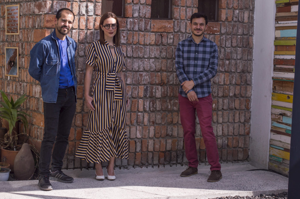
Photo Courtesy of Sybaris Collection
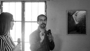
Photo Courtesy of Sybaris Collection
Conceptual and Material Art
1/ Conceptual
‘Word-art’ became prominent in the second-half of the 20th Century with the development of conceptual art. The viewer confronts an artwork replete with words, which easily convey a message. The message is akin to a poetical composition insofar complex meanings are contrived and reunited in few sentences. Yet the message contains something more than poetry. With John Baldessari, for instance, we see an ironic use of words; with Barbara Krueger we see a political use of words. Being original in this art genre requires mastery, for one has to effectively link or connect meanings with the distribution of words within a surface. This already requires a design skill and choosing a personal typology, but in the artwork we also need something more: the distributed words must adequately connected with pictorial forms. In the case of Artigas’ Vermilion (2017), the used colors not only exemplifies the label which refers it (“vermilion”) but it also relates color and label to meaning. Surprisingly, in this work the artist uses a shade of orange instead of vermilion, so this itself provide a dislocation in the immediate identification between the exemplified color and the label. Call this the ‘rhetoric’ of the work. It is not as if Artigas is only inviting to disclose the meaning of the particular white sentences; we require to do more than just this to appreciate said work. Having these dimension, Vermilon is close to minimalism, and, with respect aesthetic considerations, the presentation follows cinematographic typographies and also cinematographic mode of presentation, as if it were a screen. As for the pictorial form, the arrangement of elements is elegant, at some point simple, yet the overall composition is balanced and appears to float naturally in an indeterminate, orange, close to vermilion, field or space. In Cadmium Vermilion Red (2017), the same rhetoric is put forward –one where the label, sentences and pictorial medium cohere– but we see an advancement of the narrative pertaining the sentences themselves. While in Vermilion the inhalations and ingestions (which are alluded with the used colors) causes damages to parts of the body, in Cadmium Vermilion Red the inhalations and ingestions includes also damage to the “bones”. There is a culmination in the narrative in bone damage. Why the artist stopped there in the narrative is certainly something worthy to be asked.
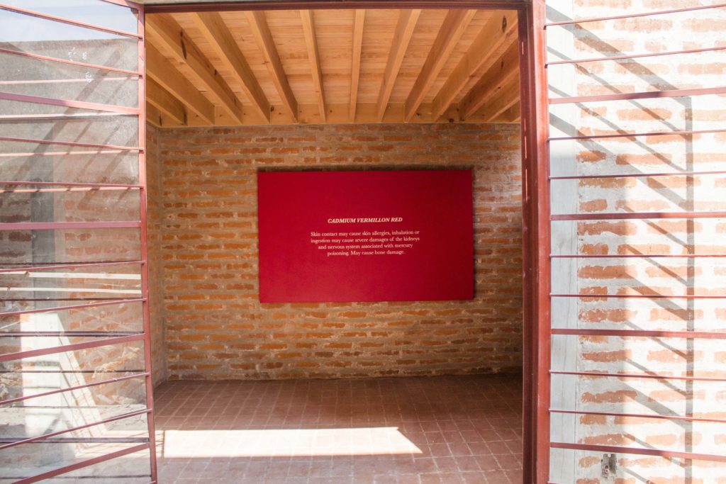 Gustavo Artigas, Cadmium Vermillion Red.
Photo Courtesy of Sybaris Collection
2/Material
Gabriela Salazar’s work explore non-conventional material for advancing her artistry. She plays with the shocking but she is also tempered, gaining a sense of equilibrium. Visually, Knot Level (2012-19) presents a vynil tube filled with blue liquid. The salient blueness creates a pleasing perceptual arrangement when combined with soft and elongated curves. Even more, we reach a sense of “horizon” far distant, when we see four lines dividing the portentous blue from the whiteness. In this respect the piece could be seen as a landscape work. It is also important to see the found hook at the top. This is a recursive element that pervades Salazar’s work. In Hook Crook, Fair Foul (2017-18), the artist emphasises the presence of found hooks for the overall composition. These hooks sustain other materials, like wood, rubber, plasticine and paper pulp. As the viewer can note, some hooks are filled and others are empty, as marking a discontinuity in the linear arrangement. In fact these hooks become a presence, a metaphor with respect possession and dispossession, like a movement between content and emptiness. Visually, the various elements tend to respect each other spaces but they also form a compositional unity. There is a palpable order though not necessarily a pattern in it. This creates a sense of displacement of the composition, as if it were departing, or arriving, to a more diluted space. In Wall Wedge (2012), Salazar disposes wood in such a way that it creates an impression of dynamism with respect the curve and a point created by the wall and the floor, which “pulls” the material into a movile centre. This provides a sense of movement in the overall, as if the piece were something volatile. However, the materiality of the wood also makes the piece heavier, as rooted firmly in the floor. It is as if the piece where a mixture of lightness and a material which is not longer free, being pulled by this movile centre.
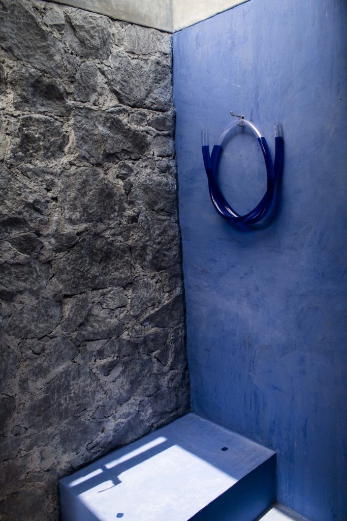
Gabriela Salazar, Knot Level 2012-2019, 22x19x8.5in
Photo Courtesy of Sybaris Collection
